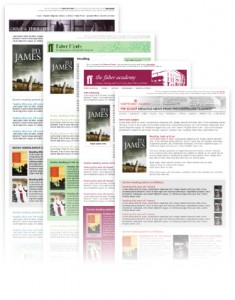
Text
Next to nameplate and masthead, text is the principal body of a newsletter. The look of the text that a professional newsletter features varies with the chosen type size and style. The number of columns also matters. Newsletters are nowadays designed on computers that store a complete palette of type styles and sizes to be used in printers. It is better to be done with the text of a newsletter in a professional-looking typeface structure gonflable that is akin to the typeface used mostly in newspapers and magazines. 
- Though it is recommended to use one particular type size and style for a newsletter’s text, a professional designer can make a rich mix of different type sizes and styles to improve the look and feel of newsletters.
- Another decision to take is the number of columns and their width. Having one column is a choice of many to keep the page simple and clear. Some topnotch newsletters are remarkable examples to it. It takes comparatively less time to create a newsletter in this format.
- The wider type line and the bigger type face make the text of a newsletter an easy read. Make sure to keep margins on either of the sides so that a reader’s eyes do not move far to read a line. A newsletter with a one column format and an inch margin is ideal.
- Two-column, three-column and four-column are alternatives to one column. If any of these alternatives is your preference, be careful about spacing between two columns. The inter space should not be so large as to make the text not pleasing for the eyes.
Headlines
Headlines are one of the professional inflatable water slide makings of a newsletter. To fetch attention to the newsletter, make sure to compose well-thought out headlines and keep them bold. Headlines should be catchy and meaningful. Newsletters with insubstantial headlines are left unread.
Departments
Most professional newsletters come with departments. A newsletter with a department is easy to read. To be more effective, the department of a newsletter needs to be kept in the same place and the same format with every issue. The department should be as simple as a box of contents to make readers turn the pages of the newsletters.
Charts and graphs
Charts and graphs are specific content design details to loosen the threads of a newsletter’s content if it features complicated information. They are good for a quick read of newsletters. Be sure to make charts and graphs readily understandable.
Art and Photographs
Art and photograph add to the visual aesthetics of newsletters. Many readers feel drawn to the visual appeal of a newsletter. It is sensible to use them only when they are illustrative of the message that a newsletter delivers. Incommunicative art and blurry photographs mar the purpose of newsletters. expiration of domains Make sure to keep a caption or cutline underneath the photograph. A well-written cutline is a clicking idea to make the reader go through the newsletter content.
Color
Two things are considerable about the color of a newsletter. One is the paper color of a newsletter in combination with the ink color. Another is a second ink color or spot color. White paper bouncy castle with black ink is the most preferable and readable color combination. Whatever be the color combination, it must be soothing and pleasing adding to the readability of the newsletter. Spot color adds distinction to the visual appearance of the newsletter.
Tags: Newsletter design